
Wave
Product Designer & UX Researcher
Institution
CareerFoundry Product Design Bootcamp
Role
Product Designer
Duration
2 months
Challenge
Problem: Water sports aficionados need a way to determine water conditions to ensure safety and preparation before entering the water.
We will know this to be true when we see users engaging with the app and continuing to use it as a resource for water and weather information.
Approach
Requirements
-
An app with an easy to use interface
-
Easy to find and accurate weather conditions
-
Safety recommendations for water sports users
-
Personalization with user's favorite spots
User Persona: Ross is a busy doctor who would like added convenience for days out on the water.
I selected a doctor because they prioritize health, safety, and evidence-based decisions. This makes them a suitable representation of users who rely on accurate water pollution data before participating in outdoor activities like surfing.
User Journey Map
User Flows:
1. checking the water pollution level
2. reminders to surf during peak time
I chose these user flows because they represent the app's primary functions and directly address users' main goals: checking whether the water is safe for surfing and receiving timely reminders to surf during optimal conditions. These features improve safety, convenience, and the overall user experience.


Prototypes
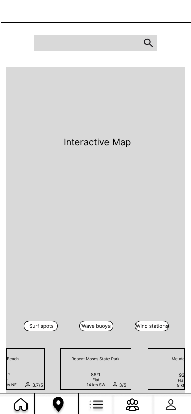
Low, mid and high fidelity prototypes
I added a community board, so that users can interact with one another. This increases the engagement of the app, and also invites future network effects.




Design Library
Wave is about building a community of water sports enthusiasts. Thus, I kept the color profile lighter and chose components from Material Design Kit for a unified user experience.
Color library

UI Elements

Icons

Typography
Title 1 - Inter Regular 24 pt
Title 2 - Inter Semibold 20 pt
Body - Inter Regular 14 pt
Buttons - Inter Regular 18 pt
Imagery

Feedback & Implementation
After sending my designs to fellow designers, I got some feedback on the designs and decided to iterate on them to improve them.
I modernized the screens to match the flow and elements of the latest apps on the market while respecting that our users were likely not futurists pining for the edge of design.
Onboarding


